JAYQA / Case study

An Indian jewellery house, interpreted for a contemporary world.

Personal. Cultural. Collectible. Considered. A complete brand world shaped around individuality and cultural memory.

Brand Strategy · Creative Consultancy · Brand Identity · Art Direction · Experience Design
Indian jewellery / Contemporary luxury

Jayqa-branded imagery shows a retail concept. Other-brand packaging, interiors and research boards are supplied inspiration references, not work created by Kiqa for Jayqa.

01 / JAYQA

A different way to see India.

Jayqa began with a question.

How do you build a jewellery house that feels deeply Indian without relying on the visual language traditionally associated with Indian luxury?

The ambition was to create a contemporary jewellery brand centred around individuality. Customisation would sit at its heart, allowing colour, stones, form, proportion and detail to respond to the person wearing the piece. Alongside this would exist rare, limited and collectible creations, pieces intended to feel discovered rather than simply purchased.

Our role at KiQa was to translate that philosophy into a complete brand world.

Not by removing India from the equation.

By looking at India differently.

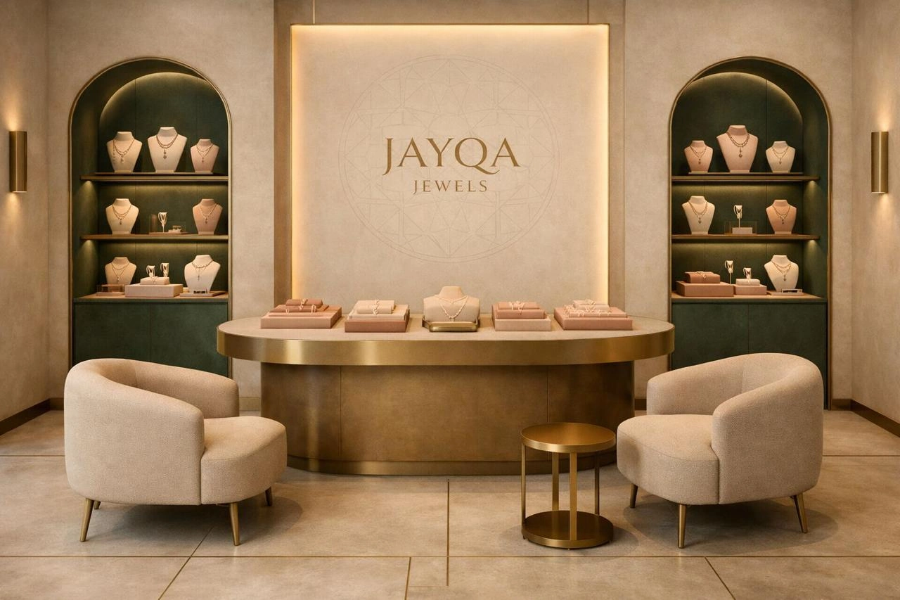
Jayqa-branded jewellery retail concept with warm lighting and sage display niches
Jayqa / Retail experience concept

02 / JAYQA

India as an Archive

We began by treating Indian culture not as an aesthetic category, but as an extraordinary visual archive.

Architecture. Miniature painting. Botanical forms. Jewellery. Textiles. Regional colour. Craft. Material. Landscape.

Instead of reproducing these references literally, we studied how their visual codes could be extracted, simplified and reinterpreted.

The result became a brand that could remain rooted in Indian culture while existing naturally within an international luxury context.

Not tradition made modern.

A contemporary identity with cultural memory built into it.

That distinction matters for Jayqa. Even its final communication system deliberately avoids familiar phrases such as “royal”, “ethnic” and “tradition meets modernity”, favouring a vocabulary around rarity, craft, form, restraint and individuality instead.

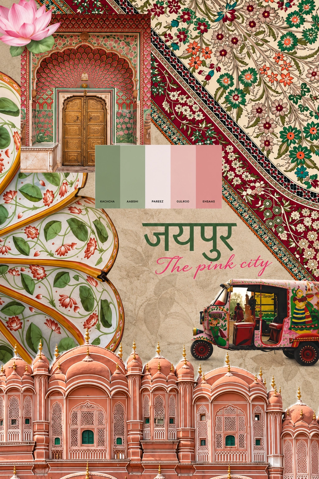
A Jaipur-inspired research board combining architecture, pattern and colour
Inspiration / Jaipur architecture and visual culture

03 / JAYQA

Finding the Colours of Jayqa

Colour became one of the earliest bridges between cultural reference and contemporary identity.

Jaipur offered an important starting point.

The mineral pinks and corals associated with the Pink City were reduced into Dusty Coral, while botanical references evolved into the deeper, quieter Sage that ultimately became Jayqa’s dominant colour.

Rather than reproducing India’s colour at full saturation, we muted it.

The final system centres Sage and Dusty Coral, supported by Cream, Deep Sage, Deep Coral, Black and White. Importantly, Sage leads the identity, while coral acts as controlled warmth rather than competing equally with it.

This gave Jayqa a palette that feels connected to India without depending on conventional codes of Indian luxury.

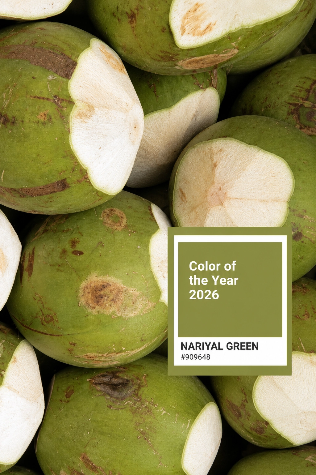
Botanical green colour reference from the supplied research board
Inspiration / Botanical colour study, not a final Jayqa palette specification

04 / JAYQA

Culture Without Costume

The visual research expanded beyond colour.

Jayqa’s illustration system draws specifically from Bundi painting and the wider tradition of Rajasthani miniature art.

But once again, the intention was translation rather than reproduction.

Elevated viewpoints, overlapping planes, intricate foliage, architecture, textiles, jewellery and richly constructed environments were brought into a contemporary graphic system. Green remains dominant, with pink and coral appearing selectively throughout the illustrated world.

The result is deliberately lush and dreamlike, while resisting photorealistic or excessively dimensional rendering.

Cultural reference becomes atmosphere rather than ornament.

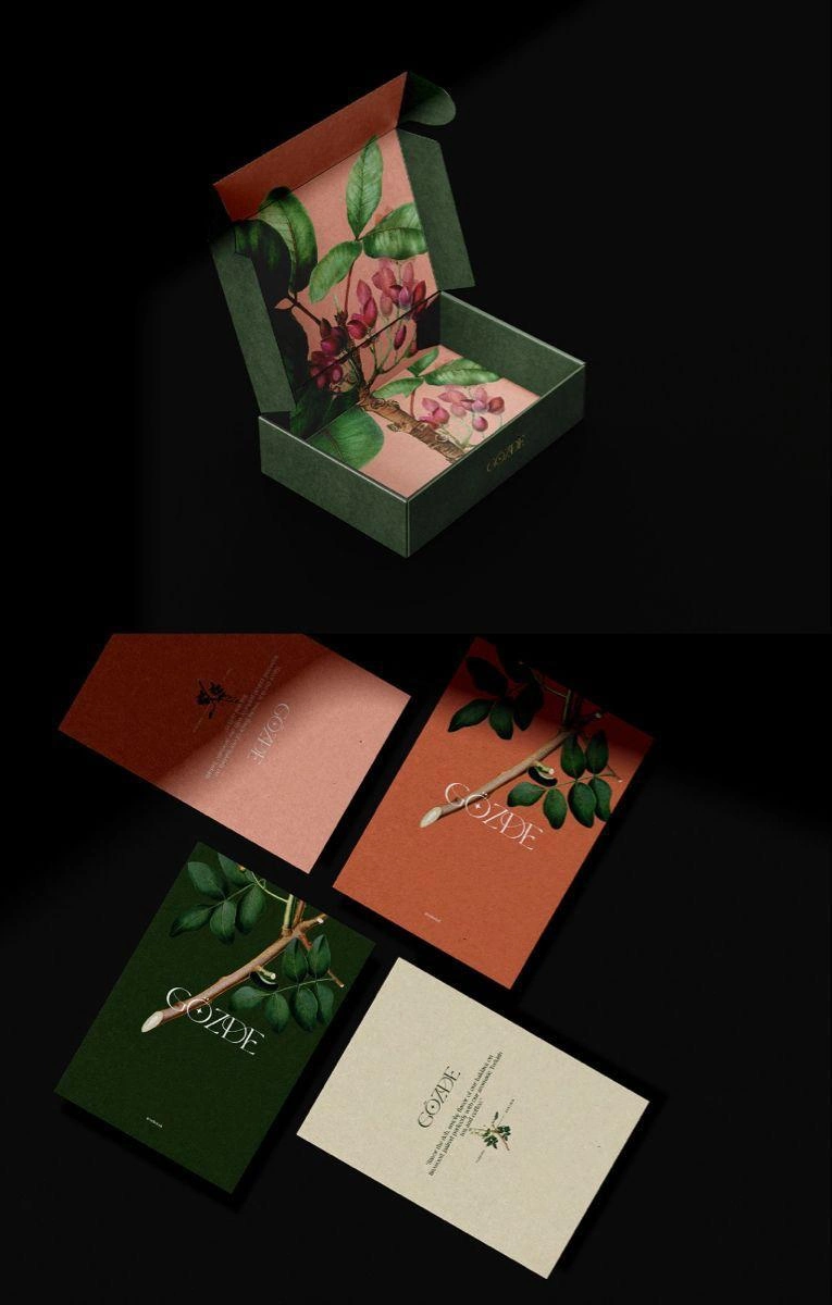
Botanical packaging and stationery by Gozde shown as an illustration reference
Inspiration / Gozde packaging and illustration, not Jayqa work

05 / JAYQA

Designing Beyond the Logo

We never saw Jayqa as simply a logo and packaging exercise.

If the jewellery was intended to feel personal and collectible, every interaction surrounding it needed to reinforce that idea.

Packaging therefore became part of the ritual.

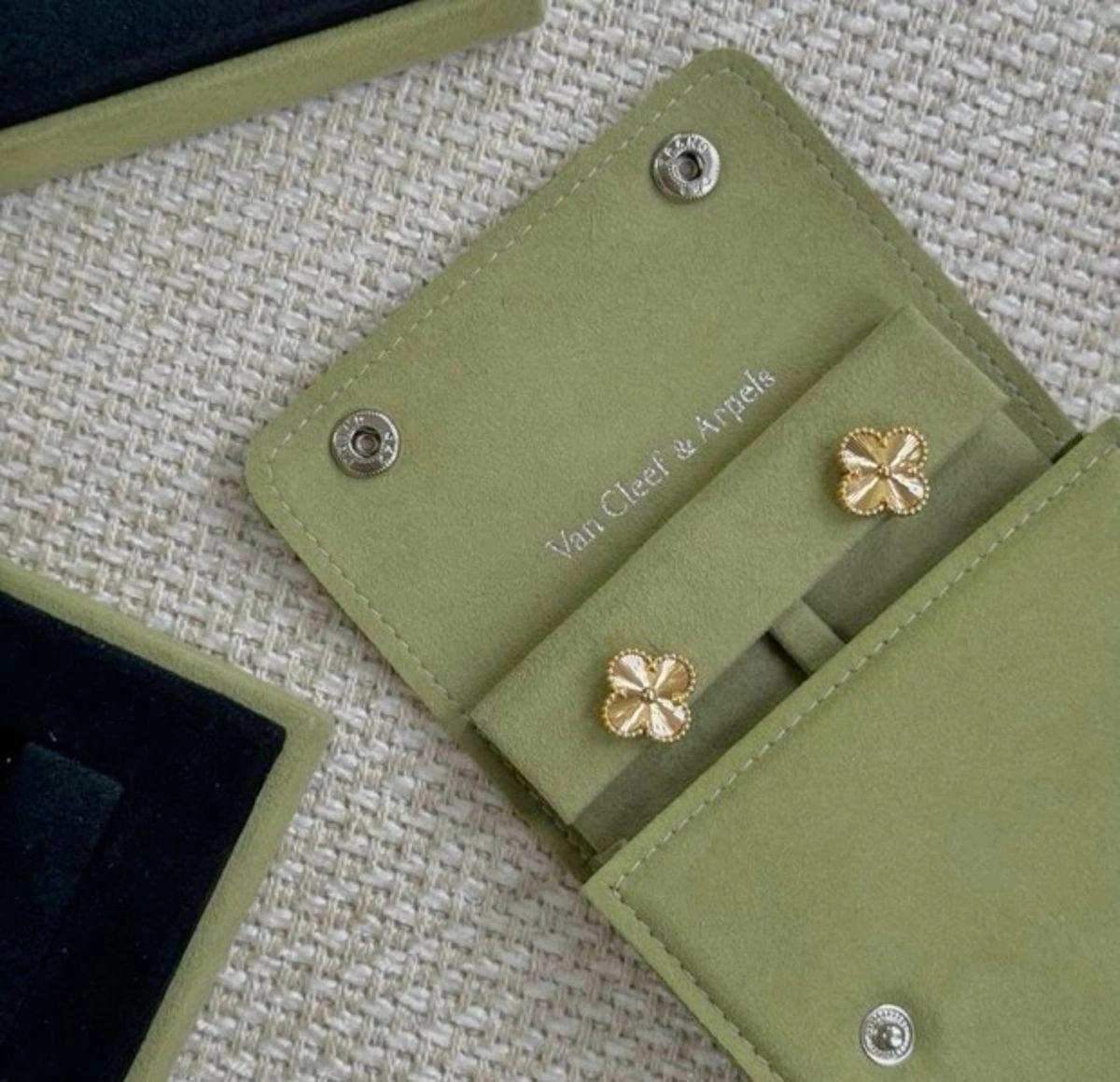
Sage suede and velvet-like surfaces, Dusty Coral interiors, restrained embossing and carefully constructed jewellery boxes transform the object into something that continues to live with its owner after purchase. The final specifications even treat the jewellery box as a permanent storage object rather than disposable packaging.

The same logic extends to smaller moments.

A Sage thank-you envelope opens to reveal Dusty Coral before arriving at a quiet Cream message card. The richness happens through sequence, texture and discovery rather than excessive decoration.

Luxury became less about adding more.

It became about knowing what to leave out.

A sage jewellery pouch used as a tactile packaging reference
Inspiration / Material and jewellery presentation reference, not Jayqa work

06 / JAYQA

From Brand Identity to Brand Experience

This is where the Jayqa project became more than visual branding.

We began thinking about how the brand should feel in physical space.

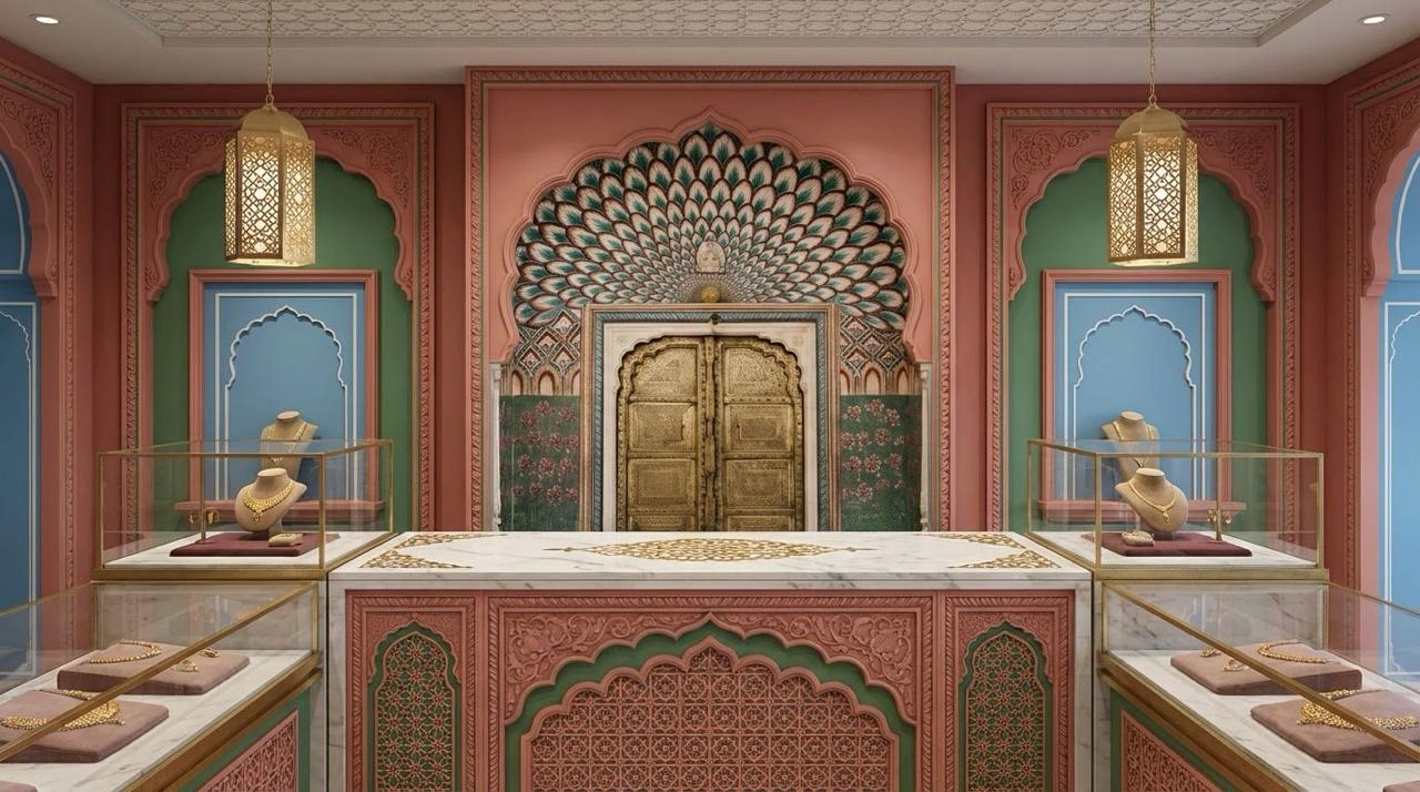
Its customer experience was developed as a sensory journey spanning discovery, retail environment, service, presentation and aftercare. Sandalwood, rose and jasmine form a potential scent memory. Indian classical influences meet contemporary sound. Warm lighting, restrained architecture, focused jewellery displays and Indian inspired hospitality extend the cultural world beyond graphics.

Even the way jewellery is presented follows the philosophy.

Museum-like displays give individual pieces space. Private consultations make discovery slower and more personal. Custom trays turn presentation into anticipation. Certificates, archive information, care documentation and collectible story books allow the story of a piece to continue after it leaves the store.

The brand therefore becomes something you encounter through sight, touch, scent, sound and ritual.

An ornate jewellery retail interior used as a spatial reference
Inspiration / Retail atmosphere reference, not a completed Jayqa store

07 / JAYQA

Designing for the Collector

Jayqa was never conceived around indiscriminate consumption.

The brand guide identifies two central audiences.

The first is the Cultural Luxury Collector, someone drawn to rarity, heritage, individuality and culturally expressive pieces interpreted through a modern luxury lens.

The second is the Intentional Luxury Gifter, someone looking for jewellery capable of representing a person, relationship or memory rather than simply marking an occasion.

This informed an important part of the creative strategy.

Jayqa should never need to shout luxury.

Its own communication guidelines describe the voice as composed, warm, intelligent and clear, sensory without becoming excessively poetic.

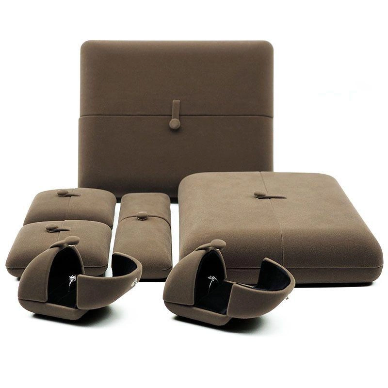
Jewellery cases and display trays used as presentation references
Inspiration / Jewellery storage and presentation, not Jayqa work

08 / JAYQA

A Brand Designed to Travel Through India

Most importantly, Jayqa was never designed around Jaipur alone.

Jaipur and Rajasthan became one doorway into a much larger cultural system.

The identity was built so that future collections could move through different regions, crafts, landscapes and cultural histories while remaining recognisably Jayqa.

That creates an expandable creative universe.

Different chapters can change.

The source material can change.

The colours, stories, jewellery and cultural references can evolve.

But the philosophy remains consistent.

Personal. Cultural. Collectible. Considered.

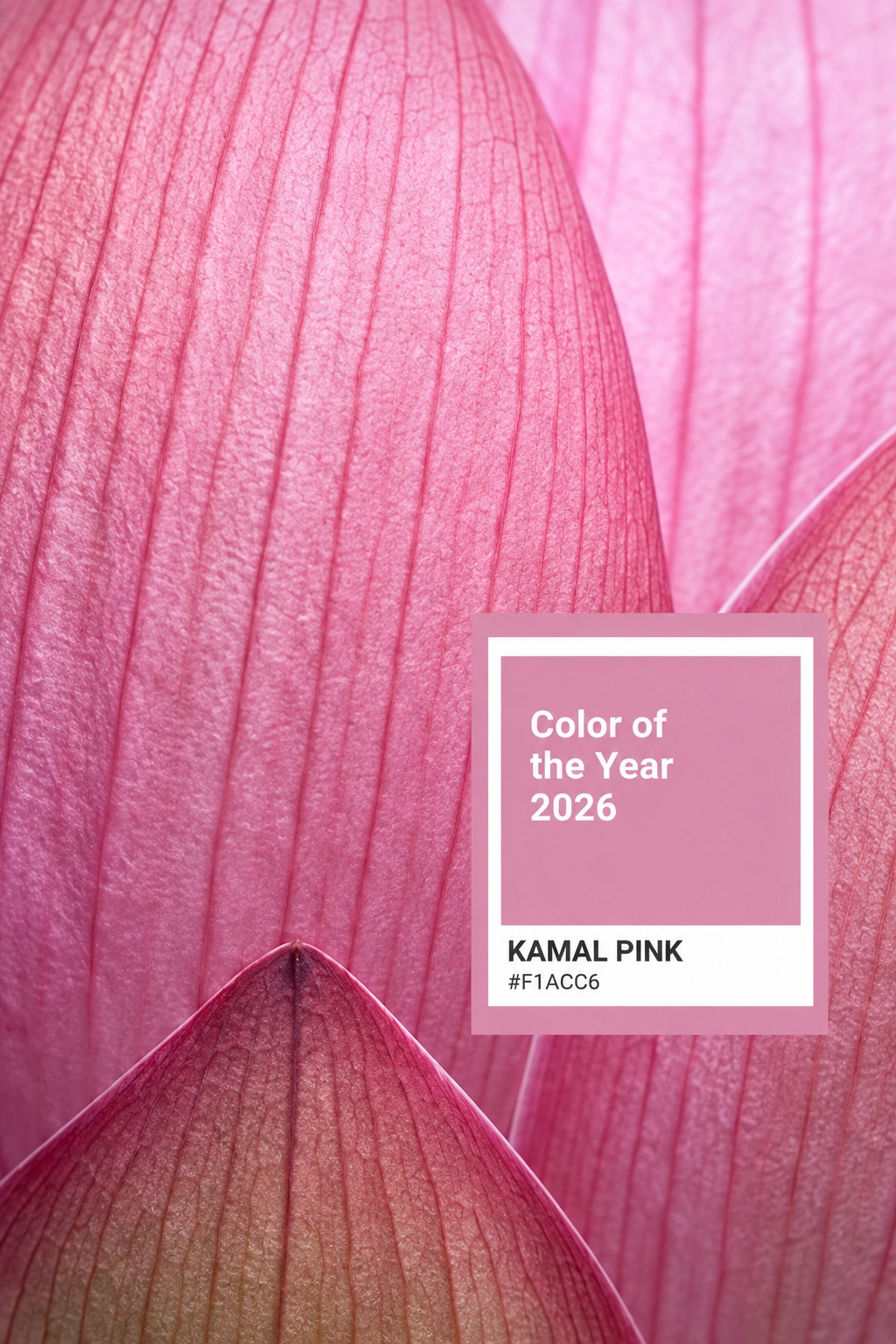
A lotus-pink research image used in the early colour exploration
Inspiration / Regional and botanical colour research

09 / JAYQA

The Outcome

Jayqa became an exercise in translating heritage without freezing it in the past.

Instead of asking how an Indian jewellery brand should look, we asked a more interesting question:

How can Indian culture become a living creative language for a contemporary jewellery house?

The answer became a system that moves from strategy to identity, illustration, packaging, digital expression, retail environment, hospitality and sensory experience.

A world where jewellery is not simply displayed.

It is encountered.

Not simply purchased.

It is recognised.

And not simply owned.

It becomes part of someone’s story.
Explore the brand concept
Jayqa-branded retail concept illustrating the proposed customer experience
Jayqa / Retail experience concept

Final work / Brand guidelines

The final brand guidelines

Explore the complete 53-page Jayqa brand guide, bringing the identity, visual language and applications together.

View the final guide (PDF)Download the guide
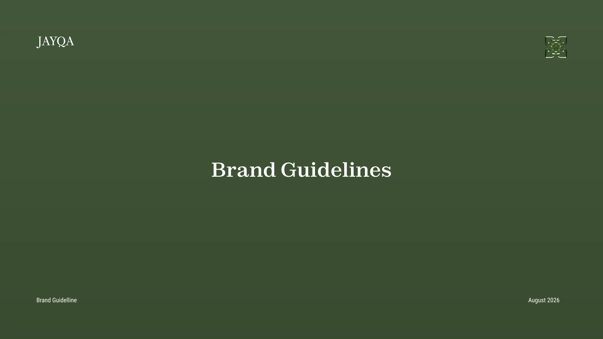
Jayqa brand guidelines cover

Client / Jayqa

Kiqa’s role

Brand strategy, creative consultancy, brand identity, art direction and experience design.

Disciplines

Creative Direction

Jayqa-branded imagery shows a retail concept. Other-brand packaging, interiors and research boards are supplied inspiration references, not work created by Kiqa for Jayqa.